|
|
|
 |
|
|
|
|
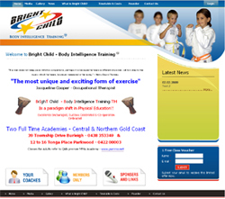
At Flexi IT Solutions we pride ourselves on developing cutting edge, editable websites. We can provide a solution for every part of your online development including; design ideas, creating content, finding pictures, designing logos and colour schemes. (Check out our recent projects)
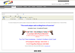
That's right, you can edit your own pages!
Flexi IT Solutions can help you expand your marketing strategy and increase your sales with your very own customised and automated online store! Whether you want a simple advertising page or a completely automated online shop with interactive applications for your customers, including collecting visitor information. We can work with your business until you have reached your online vision.
You can even manage your images and add pages to your site!
It’s simple to get started, just complete the Enquiry form and one of our solution experts will contact you at your preferred time.
Alternatively phone **** 396 911 and speak to us today!
We look forwards to the opportunity to help create your online vision to expand and grow your business to take advantage of the potential of business on the World Wide Web.
Our websites increase sales & get found by Google
Sample Website features:
-
Content Editable Websites (You can edit the pages content yourself)
-
Dynamic CMS (You can add pages yourself)
-
Email Collecting Services (Great for marketing)
-
Send a bulk email to all of your website visitors or members
-
Professional form for your Contact Us page (Visitor submits their contact details and enquiry)
-
Members only pages, logins etc.
-
Structured Latest News page (You see a snippet on your site design with a more details link)
-
Structured Image Gallery (You can create albums and organise your pictures, great for portfolios)
-
Flash (Animation, including visitor interactive animation)
-
Tracking of visits and page activity
-
Search Engine Optimisation, ongoing or built in
|
|
Web Design Tips
- Keep your page sizes small
You want your web pages to load fast. Small page sizes mean fast loading. Google likes this as well. Generally people browsing websites are really impatient so it’s important that they don’t have to wait long for your pages to load.
- Cross browser compatibility.
Not many customers are aware of this but website browsers can interpret your website differently, specifically in the layout and showing images correctly. Just because Internet Explorer shows your website as you like it, other popular browsers like Mozilla Firefox or Safari might not. You’ve also got to make sure you website works with older versions of those too. So before you hand over your final payment to your web developers, be sure to check your site out on at least IE, Firefox and Safari to see it’s all showing correctly
- Create your own custom 404 error page.
When someone accidently types in the incorrect path to your website, there’s nothing worse than being directed to a standard 404 error page. What I’m talking about is, www.flexi-it.com.au is this website but then you type in www.flexi-it.com.au/software where it should have been http://www.flexi-it.com.au/software-database-development.aspx . If you don’t have a custom 404 error page you’ll arrive at a blank white “The page cannot be found” page with some error information. The page looks nothing like your website and you’re likely to lose that site visitor.
You can easily replace this page with your own version which, should look like your website, include links to your various pages so they can get to where they intended initially and maybe a google search tool for your site, either way it’s a much more user friendly experience for your site visitor.
Another scenario were you may be accidently at fault is where you’ve got an external link to one of your internal web pages and you’ve since renamed or removed that file, therefore creating a now broken link. Good web design should include a custom 404 page.
- Make your image file sizes small. You want your website to load fast, people don’t want to be waiting around for your 1mb picture to load. Compress your image files using tools such as adobe photoshop, you’ll barely notice the difference in quality if any and it will make your web site a more user friendly experience.
- Don’t have annoying pop ups! Remember to view your website through the user’s eyes, not the site owner. The only pop ups that are acceptable is in cases where the user wants to view the larger version of a thumbnail picture, but of course in this instance that’s what they are expecting and is beneficial.
- Write your website content so it can be easily skip read. Most people are lazy when it comes to reading web pages. Unless someone is specifically looking for the detail of something your "normal" paragraphs of same coloured, very formal looking text is just not going to be read. You can do things like bold the main points in a paragraph or layout the page so you have your selling points are bigger, like on this page. Writing in bullet point form is also great, it makes it easier for readers to get the facts quickly and if they are interested then they'll read the "normal" boring paragraphs, like this one :)
- Watch what colours you use. Certain colours trigger certain emotions in people. Red is a colour generally associated with anger / warning etc. Possible not a good choice as a main colour for your web design template unless you're a Fire Hazard Protection type business. Bland colours like beige and grey's are not very stimulating to the senses, if you're a boring government association then maybe you could get away with it. Bright colours stimulate the senses however don't over do it unless you're a clown shop or something :) White as a background I personally feel is great for a family orientated customer friendly website like the major phone and computer brand websites have. Pastels without a bright colour to liven it up can come across to me personally as warm, nurturing.
- Don't have too many colours. Generally colours are used to sub divide a website into sections or highlight certain text. If you're using too many different colours in the one section it looses its effect, bit of a sensory overload so to speak. Make sure all your pages are easy on the eye, and that your eyes are drawn automatically to the main points your page.
- Get your point across. Ask someone to view your website and straight away ask them where their eyes focused first. Not where you wanted? No doubt you want certain things about your website you want visitors to notice straight up, usually your selling point. I suggest changing the colours, highlighting, do some bolding, positioning, change the graphic design, things like that. Then of coarse do the same test again until you get the results you’re after.
|
|
|
|
|
| |
|


